My Approach to Designing for This Client

I choose the designs I will engrave on glass or mirrors according to the room’s decor, functionality,
and the shape of the frames. For this noble residence, I had to consider three key factors:
1.Providing privacy by obstructing external visibility.
2.Adapting to the shape of the frames already chosen by the architect.
3.Creating a decorative motif to replace curtains, as the client has severe allergies.

I selected a floral motif by the artist Maurice Dufrêne. The original design was printed in three colors (from the book Dekorative Vorbilder – 1890), but its fluid movement appealed to me, so I created a stem to give it form. I repeated the image in each frame to ensure full coverage at eye level.

.In the same house, I also adapted the same motif using a mirrored effect, reproducing it on the fixed glass panel in the living room and the two glass panels in the entrance hall
.
Maurice Dufrêne is remembered as one of the great French designers who helped shape the transition from Art Nouveau to Art Deco. His work influenced interior design, furniture, and luxury decoration in the 20th century, leaving a lasting legacy in the field of decorative arts

The house where I was invited to create my art on the façade was charming, located on a very traditional residential street. Privacy was essential for the interior.
However, I had no references for the interior décor, as the house had just been built. The architecture was modern, but during my conversation with the clients, I felt a strong sense of tradition.
Technique: Sandblasting on tempered green glass, leaving the design transparent
That reminded me of something I once read: “One of the glories of the Victorian house—be it a modest frame cottage or an imposing stone edifice—was the stained glass work adorning its windows, doors, and transoms, which perfectly complemented the grace and dignity of the Victorian dwelling.” I chose this Victorian stained glass design, but instead of the usual metal framework, I left those lines transparent. Creating this piece was truly rewarding.
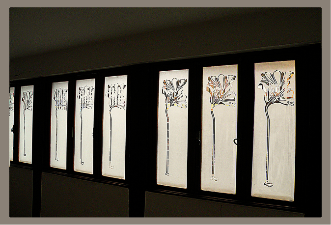
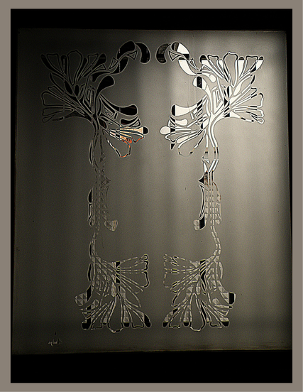
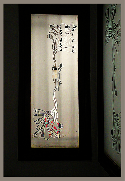
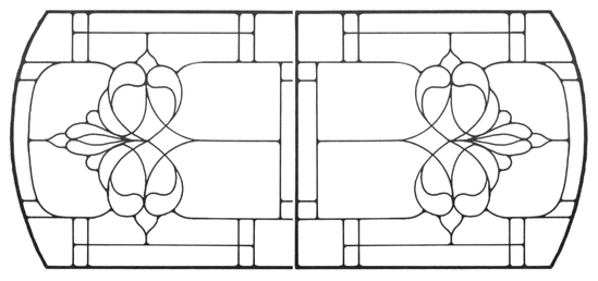
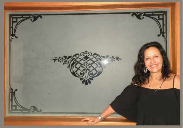
After a renovation, a large opening was created in the wall of a circulation area in the apartment to bring more light into the living spaces. I needed to choose a decorative yet neutral design that would complement the different rooms—TV room, dining room, and living room—without overwhelming them. I selected different motifs, separate yet visually connected, from one of my research books, a 1979 edition. This edition was compiled from Catalogue “K,” Period Carvings of the Syracuse Ornamental Company, originally issued in 1923 in Syracuse, New York. The company manufactured Syroco fiber wood units for moldings, panels, ceilings, and other decorative applications. 
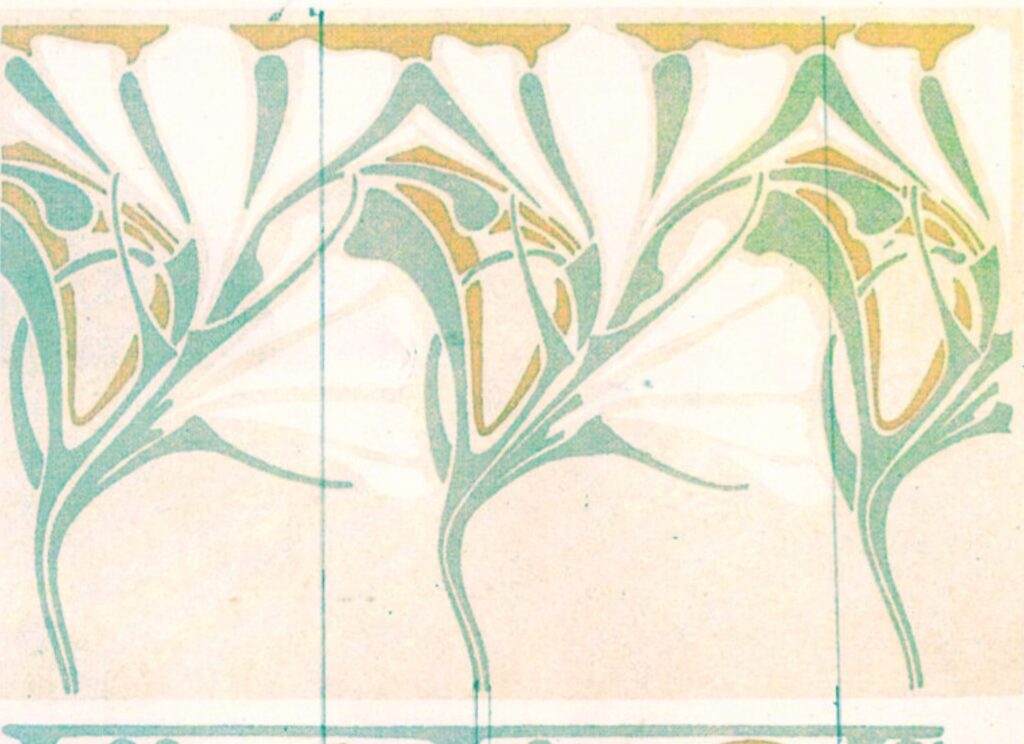
Interestingly, this catalog had 380 pages and was used by Syracuse salesmen to present their products to architects and carpenters.
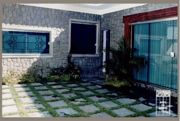
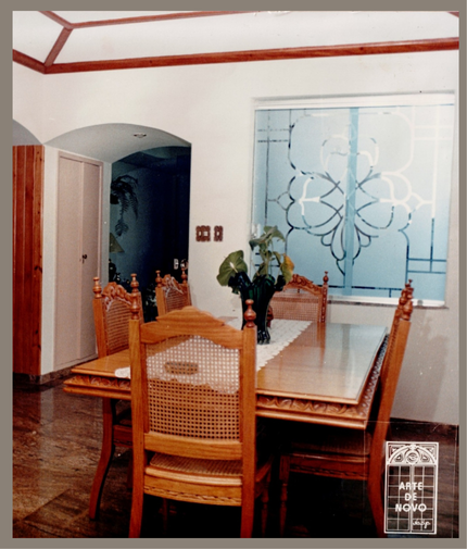
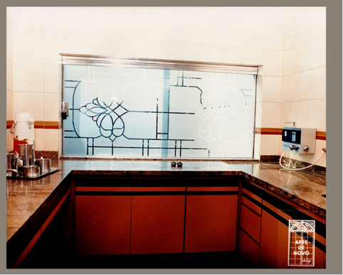
IIt contained thousands of beautifully rendered illustrations showcasing borders, scrolls, swags, trophies, garlands, cornucopias, and other motifs in various period styles, such as Medieval, Renaissance, Baroque, Rococo, Chippendale, Adam, Louis XIV, and Victorian. They likely never imagined that the catalog they used daily to sell their products would one day be recognized as a treasure trove of designs to artists from various segment