“My work’s photos were not taken professionally and may not be perfect. I have included cultural texts explaining the artists who inspired each of my designs.” Nadja Bara

Much of this rare material, which inspired my works is published originally appeared in late 19th-century and early 20th-century catalogues from the following printers and typesetters:

Barnhart Bros. & Spindler (Chicago,)
H. Berthold (Berlin & Stuttgart),
Deberny et Peignot (Paris),
Joh. Enschedé & Sons (Haarlem, NL)
Vanderborght (Brussels),
E.J. Genzsch (Munich),
Successors to Benjamin Krebs (Frankfurt),
Keystone (Philadelphia),
J.G. Schelter & Giesecke (Leipzig),
Van Loey -Nouri (Brussels),
Wilhelm Woellmer(Berlin),among others

The enlargements of the
decorative motifs were made by hand, as were the vinyl
cutouts, which were later sandblasted to engrave the designs

“My work’s photos were not taken professionally and may not be perfect. I have included cultural texts explaining the artists who inspired each of my designs.” Nadja Bara

On this arched glass panel dividing the living room and the dining room, I made some adaptations to suit my technique while preserving the lightness and fluid movement characteristic of Art Nouveau.

The turn-of-the-century Arts and Crafts movement revitalized many artistic and craft domains, including, of course, typography.
One noteworthy aspect was the typographical ornament, a long-standing tradition among the earliest printers once again brought to the avant garde of desing.

II have in my hands the edition from 1982, a treasury of authentic Art Nouveau typographic ornaments, selected from specimen catalogues of leading European and American type foundries, in the Solo Type.
Over 800 of all types include the patented Art Nouveau .This collection is specially rich in floral and plant ornaments, including many recognizable flowers, trees, fruits, and vines . Animal motifs-butterflies, dragonflies, fishes, lions, peacocks, pheasan, snails and turtles-abound, as do fluid redenring of humans figures, fabulous creatures and other, purely decoratives elements.

This partition was a real challenge for me.
Dr. Maurice wanted to bring joy, peace, and lightness to the partition in his office.

He specifically asked for a design that would make his patients not feel like they were in a clinic. I reproduced the flowers from the book-Solo Type , and created a sense of movement
with them.

.

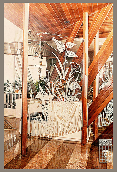
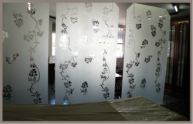
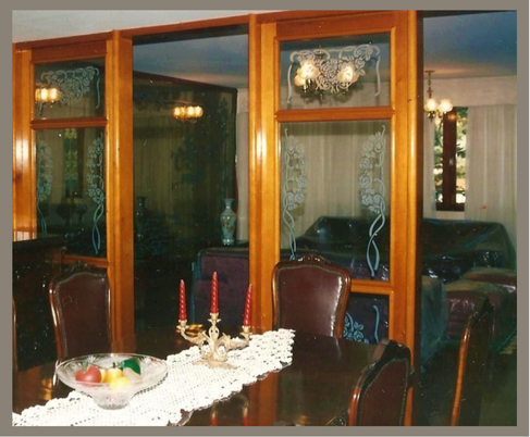
Partition as seen from Dr. Maurice’s side
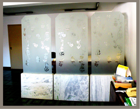
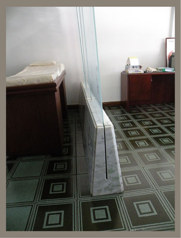
I designed the marble base to serve as support for the glass, eliminating the need for framing and creating a lighter atmosphere. This design not only added elegance but also enhanced the functionality of the space—goal achieved.
The photo above is the view of the partition as seen from the living room
The photo on the side shows the partition as seen from the dining room side.